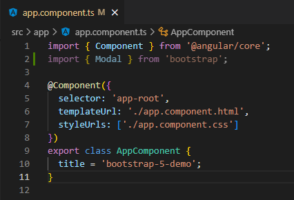
I recently found myself on yet another Angular + Bootstrap project. Usually, when spinning up a new Angular Bootstrap project, this means npm installing a library like @ng-bootstrap, but this time we wanted to keep things as vanilla as possible.
“How to use Bootstrap in an Angular application without jQuery?”
Since we’re in Angular, and since it’s generally considered a bad idea to use jQuery in an Angular project (though it is most certainly possible), we were forced to think about how to best use Bootstrap “from scratch”.
Up first – get a major pre-req out of the way… It’s been a while, so I guess I should ensure I’m on latest LTS😲
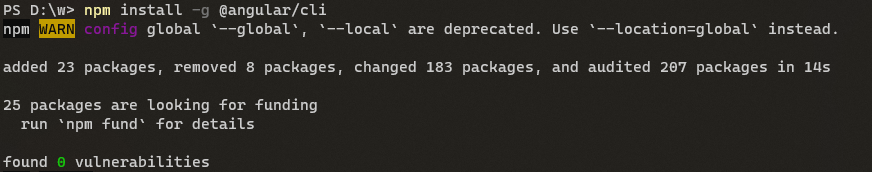
For this project, we’re also going with the latest and greatest from Angular, so…
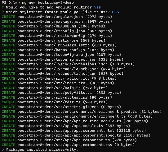
Now lets get a clean Angular workspace spun up…
For simplicity, we will start slow – simply displaying a Modal from the AppComponent in the presentation of a Confirmation Dialog.
I’m opting to go with a Modal because it’s a frequently desired component of Bootstrap, and I believe that it allows us to demonstrate a number of angles with regards to using a Bootstrap Modal ‘natively’ from Angular (without jQuery).
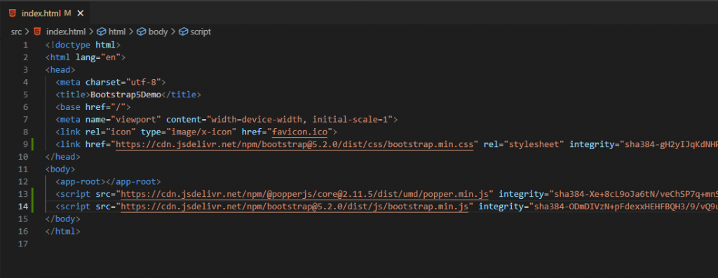
Normally, I’d opt to go with self-hosting for my libraries, but since this crash course is more focused on how to use Bootstrap natively in an Angular application rather than productionizing the solution, I’m just going to use a CDN from the Bootstrap getting started docs to get things wired up.
To make things a bit easier on ourselves, we’re also going to install the Bootstrap types package from the Definitely Typed project as a developer dependency in our project.
npm install @types/bootstrap --save-devNow that we have the basics set up, let’s start in our AppComponent by importing Modal from bootstrap (via the @types/bootstrap package installed in the previous step):
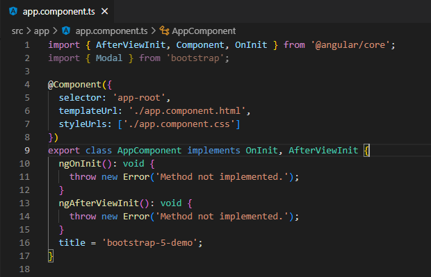
To get our Modal setup, we’re going to utilize the AfterViewInit lifecycle hook to wire up our event listeners so that we can respond to our Modal instance:
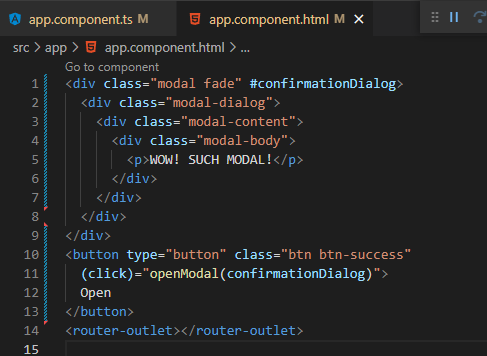
As a sanity check, let’s go ahead and wire up the Modal as simply as we can – triggering the modal show with a button click:
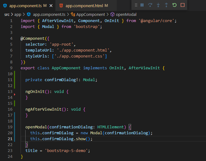
As you can see in the above code, we’re able to simply create a Modal instance in TypeScript-land thanks to our @types/bootstrap library -then we can simply call ‘show()’ to open our new Modal:
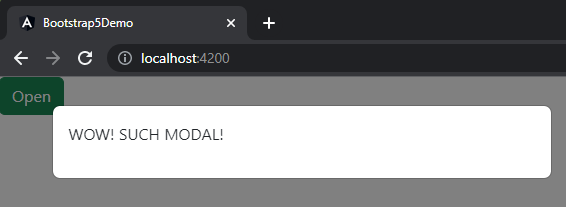
Okay. That’s all well and good, but unless we’re just wanting to show some static message, this Modal is pretty lackluster.
Let’s go back to our AfterViewInit lifecycle and set some things up… But what exactly? Perhaps we should go take a quick, cursory glance at the Modal docs…
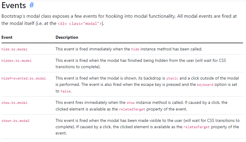
Alright… So we’ve got a handful of events we can respond to… For the purposes of this example, we’re going to focus in on ‘hide’ and ‘show’.
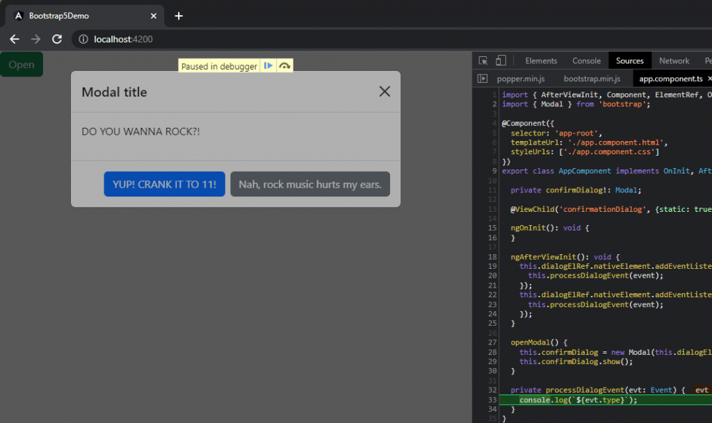
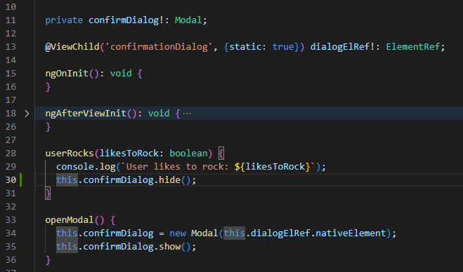
In addition to wiring up event listeners for ‘show’ and ‘hide’, we’re also going to change our implementation a little bit – rather than passing in the element from our template, we’re going to access the element via the @ViewChild property decorator. And lastly, we will log our events to the console:
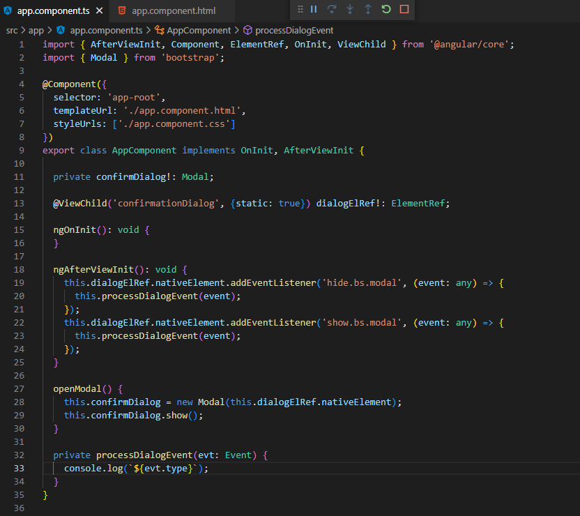
Some points to note in the above code… We’ve introduced the Angular property decorator @ViewChild(…) – this has enabled us to stop passing in the element from the template via the template variable as we were originally doing. We’ve also added some code to our ngAfterViewInit lifecycle method, which is responsible for listening to the ‘show’ and ‘hide’ events – simply logging the ‘type’ property associated with the Event via the processDialogEvent() method.
Let’s check it out:
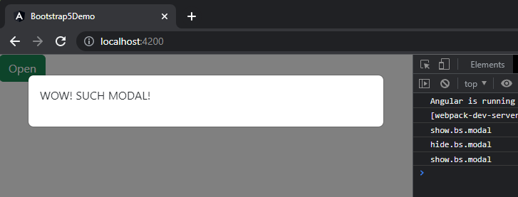
Whelp… Still pretty lackluster… One could be forgiven for mistakenly concluding we’re just showing the same demo as earlier – but we know they’d be wrong because this is a completely different monster altogether (since we’re using ViewChild and listening to/logging events now)!
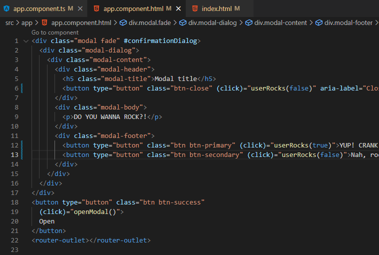
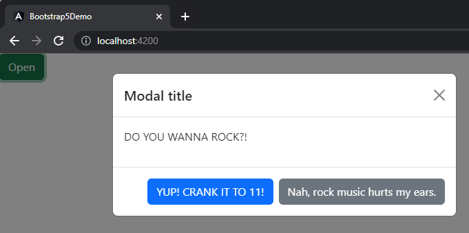
Alright… Let’s get this thing done… Right now, we just have a message modal – but we need a confirmation dialog… So we will spruce things up a bit with some formatting/structure and we will add a couple of user prompts – something for them to confirm (or not).
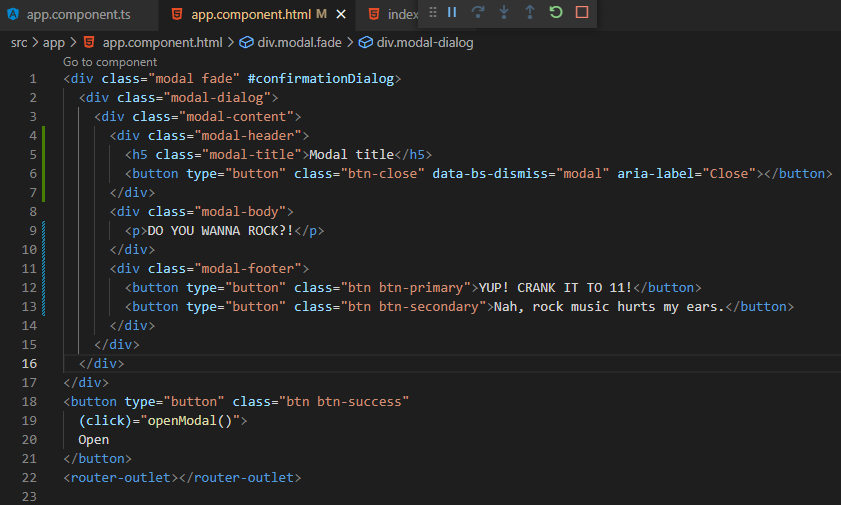
And here’s how it looks in action:
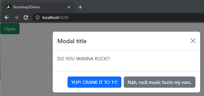
Now it’s starting to look more like a proper confirmation dialog!
Something I’d like to point out at this point in the process. Remember our event listeners? Perhaps you noticed we added a new ‘X’ close button element, and that this element has an interesting ‘data-bs-dismiss’ now present. Bootstrap supports interaction via data attributes, and this attribute demonstrates how to close this modal instance using one such data attribute – read more here in the docs. Oh, yeah – and the event listeners? Still listening – even when we’re closing via the data attribute:
But we still need to do something about those button clicks… And as cool as being able to close the modal via the data attribute is, we don’t really know if the close was by clicking outside of the dialog or if it was intentional via the ‘X’ – and I’d think the ‘X’ could commonly be interpreted as “No”, as where closing via clicking outside of the dialog could be “I’m declining to answer right now”, and that perhaps we want to handle those two interactions differently.
First up, let’s add a new method to assess if the user likes to rock or not – ‘userRocks’:
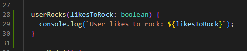
Next, let’s wire this up on the template to the ‘X’ close button and the other choice buttons – passing ‘true’ when they do and ‘false’ when they don’t (I have a feeling those ‘false’ ones rarely get used, and only by people you probably wouldn’t enjoy writing apps for):
And let’s see it in action:
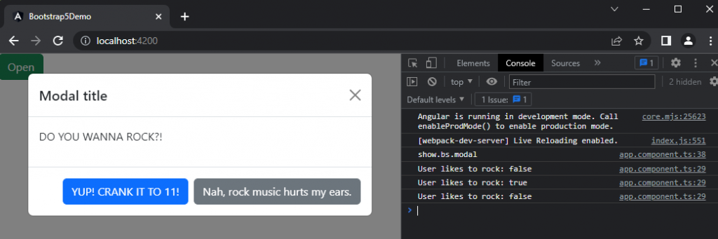
Cool-cool-cool. Looking more and more like a proper Confirm Dialog by the minute! But we have a bit of an issue… We know if the user rocks or not – but most users would expect the dialog to do something other than log to the console, which they wouldn’t even be aware of unless they’re a super 1337 hacker looking at the console while trying to find their exploit.
Let’s start simply by having the modal hide after the user has provided an answer… Easy enough – let’s just modify our userRocks method to call ‘hide()’ on our Modal instance:
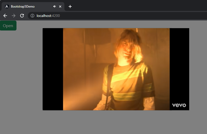
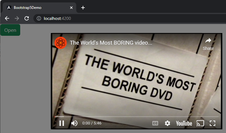
Now we’re cooking! Let’s put this baby to bed! At this point in time, we have a functional confirmation dialog that allows the user to let us know if they like to rock or not – all that’s left is to do something based on the user’s willingness to rock.
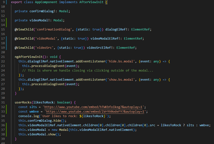
For the sake of brevity (🤣🤣🤣 Never been a strong suit of mine), we’re just going to introduce a few lines of code to our userRocks method and some supporting code to our AppComponent implementation. Namely, we’re going to add another Modal (why not?! This is a Modal example, afterall!) as well as another ViewChild that makes accessing an element within the Modal a bit easier so that we can mess with it in our userRocks() method based on the user’s input.
Here’s our updated component TS:
And here’s our updated template:
And here’s how it looks running:
We like to rock:
We have sensitive ears and “refined” musical tastes:
There you have it – how to use Bootstrap 5 from Angular 14 ‘natively’.
While we really only covered the Modal here, many/most of the approach we’ve reviewed here translates to other Bootstrap Components.
I hope that you’ve found this helpful and perhaps even a little entertaining. If you would like to check out the full source for this project, feel free to check out the project here: https://github.com/mattezell/bootstrap-5-demo
Tootles!
-Matt